Case Studies,Web Design,Web Development
Three Dots reached out to Satur9 to help them realise a new, fully-bespoke website based on their distinctive tri-service concept. As a communications consultancy with over two decades of experience, they enable people and organisations to connect with others in an authentic, engaging way – and needed a website to reflect this.
Collaborating with founder Kim and her design team, Satur9 developed prototype designs based on video and layer-masking, before settling on a “circular” concept. Complete with animated dots, this helped represent the company name and, of course, the Three Dots logo itself.
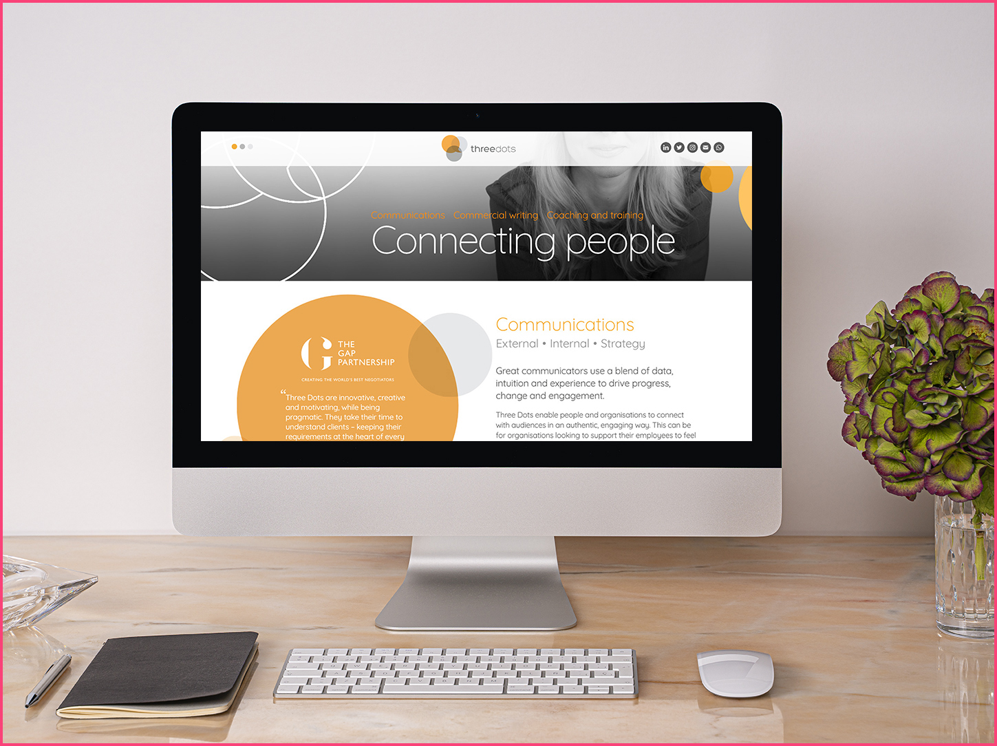
The final result is fully client-editable, and showcases Kim’s expertise alongside extendible testimonial sections. Visitors can easily find contact details – and all within a single page.
Director, Kim Aitken, recalls:
“After taking the time to understand what we were looking for, Lewis offered options and provided recommendations based on these. This way, we made decisions based on solid comprehension of these development options.”
The circular areas required special attention, but the website is optimised for all screen sizes and mobile devices. Content animates into positions, and a scroll-jump navigation allows easy access to each of the sections and services Three Dots offers.
The back-end CMS is kept lean and easy-to-use, and training was provided so that updates to the website can be made without assistance.
Kim adds:
“Lewis is wonderful to work with. He is calm, measured and patient — and adept at communicating technical information in a way that anyone can understand. Lewis is highly skilled, experienced and dedicated to his work, and it’s a bonus that he is such a lovely person.”
Highly-creative designs such as this are always satisfying to work on, even with the added challenge. Like all projects Satur9 develop, further updates and extra features are considered from the start – ensuring Three Dots will have room to expand in the future.
Have a look at the website here: www.threedotscomms.com
Kim, in closing:
“We are delighted with our new website! Love the movement in the site and how this brings a sense of fluidity to it. Clients have said it is easy to navigate, looks great and is engaging.”
Is your website looking the worse for wear? If you want to talk to us about taking your website to the next level, get in touch today.
branding, cms, loughborough web design, uk web development, wordpress